Amplience
Brand Identity
Amplience combines AI, data, and insights to help enterprises deliver personalized, persuasive content for connected shopping experiences.
Before the rebrand, Amplience's visual identity was burdened by bright fuchsia, muted grey tones, excessive capitalisation, unpolished imagery, and a harsh icon. This contributed to missed opportunities, fragmented communication, and a weaker overall experience, which wasn’t ideal for a company focused on commerce.

A new vision
All of these core brand elements came together to form a bright, bold, fun and confident new brand expression for Amplience. Bringing consistency and levelling the business up to stand shoulder to shoulder with it's often much larger competitors. The rebrand was unveiled to the company and its investors at our team all hands. In order to do this, a brand film was produced.
A new unified brand experience
As part of the new brand experience, I developed an extensive mood board that illustrated how the revised colour palette, typeface, tone of voice, and photography would cohesively work together across different media platforms. This detailed visual guide was crucial in maintaining a consistent and unified brand presence, ensuring that all channels presented a harmonious and well-integrated experience.

The complex simplified
At the core of Amplience’s suite of products is a complex technical infrastructure that can be overwhelming for those unfamiliar with it. To make this intricate backend more accessible, we created a clear visual language to illustrate how our headless CMS and content management solutions function.
This approach helps demystify the technology, showing users how the platform integrates with their systems and simplifies content delivery across multiple channels.


The importance of a modern experience
For Amplience, a compelling and visually engaging web experience is crucial, given the competitive landscape of the commerce technology industry. As a company that provides advanced headless CMS and content management solutions, Amplience needs to showcase its own expertise through an impressive digital presence.
A well-designed web experience not only reflects the innovative nature of its products but also demonstrates the capabilities of its technology in a real-world context. In an industry where user experience and content delivery are paramount, an appealing and intuitive website can significantly enhance brand perception, attract potential clients, and effectively communicate the value of its solutions.
Authentic visual connection
By carefully choosing images that felt open and honest, we were able to create a distinct connection with the audience. Thoughtful decisions around composition and lighting ensured that the photos felt authentic and trustworthy, helping to build a genuine connection with viewers while staying within budget.


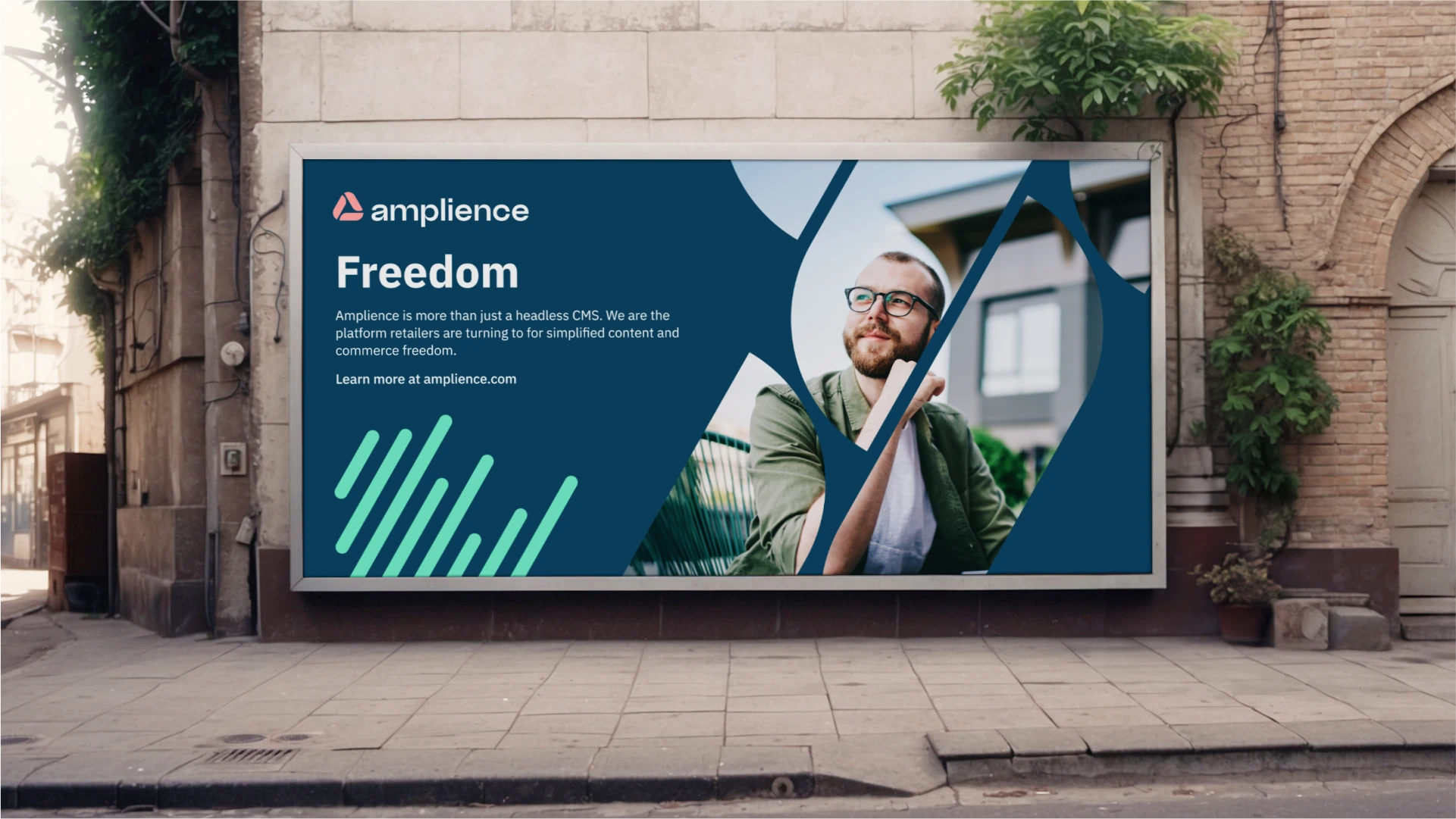
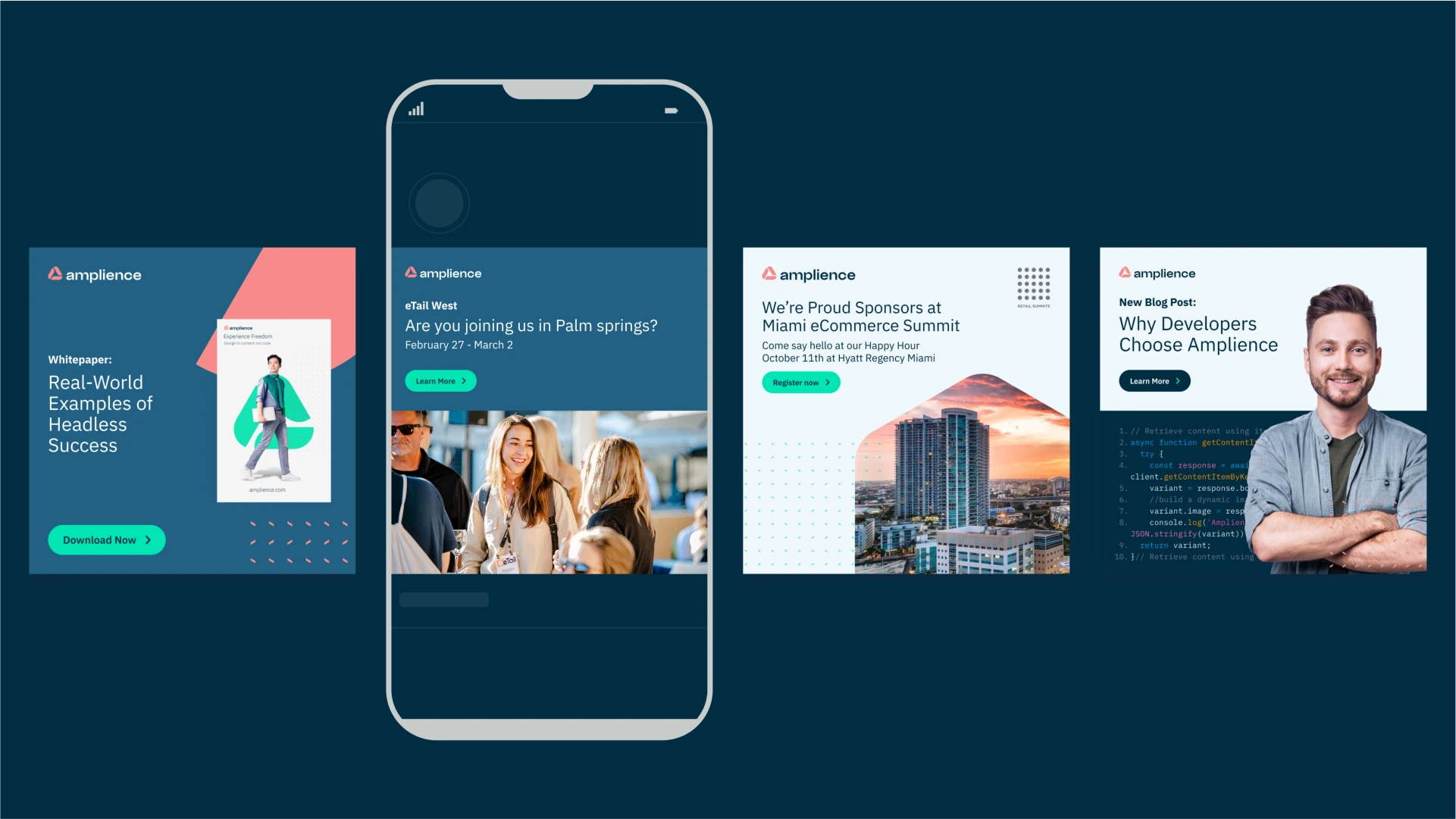
Thinking big
At the time of the rebrand, Amplience was not yet a global leader, but I felt it was essential to explore how the brand could scale and present itself across a diverse range of channels. By doing this, we were able to provide key decision-makers with a clear vision of our future potential and the strategic direction we were aiming to achieve. This comprehensive approach helped illustrate our aspirations and demonstrated the broader impact of our rebrand.